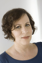
Sari Goodfriend Part2 of PhotoPlus Expo

OK, so back to Tyler Stableford lecture: Other tips I learned in no particular order (and forgive me if this is all old news to those of you reading this)
*There’s a preset in Catalog Settings that allows you to set a time to discard your 1:1 previews if you don’t need them anymore after editing the job, thus allowing you to save a little space in your Lightroom catalog, not to mention your hard drive. Julianne Kost today said, however, she doesn’t bother having her computer discard the large size previews because she likes to have them available to go back to and she’s got something like 4.5 terabytes of HD space. Lots ‘o space there…
*Reducing contrast reduced clipped exposures
*For outdoor shots, you don’t need to be as concerned with white balance, just make it look good on your calibrated monitor – outdoor shots these days for all media are showcasing such a variety of color and different saturation levels that it’s completely subjective for this genre anyway.
*Check in the Histogram chart by mousing over the spots on the photo you are concerned about to see if you are losing blacks. It’ll show percentages.
*Only go within +/- 15 on the TINT slider.
*Fill light is the most pixel damaging tool so use it sparingly.
*A good way to work an image with two widely varying exposure levels like a landscape where you want the deep blue sky in the background and the shadowed foreground with flowers is to process the image two ways, export it into photoshop and then merge the two layers by using a layer mask and the brush tool and brushing in the layer underneath which has the exposure you want. If this is unclear, email me! (sari@sarigoodfriend.com)
*”tone curve” is similar to Brightness and contrast but it’s better. Brightness basically lightens the middle tones of an image.
*Clarity affects the midtown contrast and creates texture. For example in the clouds of a sky shot. Just be careful of extra haloing in clouds
*Vibrance boosts the saturation in the least saturated regions and mostly affects blues and greens.
*Saturation hits the oranges, yellows and reds. It’s a heavier tool than vibrance so keep it under 20 on the slider. It’s also not so great for skin tones.
*To eliminate haze in a sky, crank the vibrance up and then bring the color temperature down to make it more blue and work in the HSL (Hue, Saturation, Luminance) dialogue.
*Speaking of HSL module (I don’t know if that’s the official term, but that’s what I’m calling it), if you’re not using the little target button to adjust the density of color on your images, start doing it. You just click it (it’s under HUE) in Lightroom 2, then put your cursor somewhere on the photo that you want to darken or lighten and move the mouse literally up and down on the image and the color will be affected. You’ll see the sliders on the right moving in accordance with these shifts. You can also of course, move the sliders manually, but this might be “smarter” since the computer knows exactly which colors it’s reading.
*If you’re going to need to make black and whites or sepia versions for a client (or your own artistic fulfillment), do all the corrections and adjustments to the image, then make a “virtual copy” (CTRL click) and make THAT copy the B+W or sepia or whatever.
*There are several different ways to make a B+W image, the easiest of course is just by clicking the “Grayscale” button in “Treatment” under BASIC in LR2, but Tyler prefers to make them by going into the Saturation slider and taking it down almost, but not quite all the way. He likes to leave a little hint of color and sometimes to make sepias, you’ll need that color. His recipe for Sepias was to adjust the sliders in SPLIT TONING to the following: under highlights, set the Hue at +40, Sat 0 (I think), then shadows: Hue +240 and Sat +22 (I’m sure).
Basically, just keep your highlights warm and your shadows cool. I had never realized that was so effective before, but it really looked good, even on the huge projected screen. Kind of blueish shadows but with a warm glow overall.
*The last thing he showed us was how to sew images together. I know this is pretty basic, but I’ve still never done it. Apparently if you have three images to stitch into a panorama (and this can be horizontal or vertical, by the way), you just select all three at the same time, then CTRL click on one image and when the list comes up, choose EDIT IN and then MERGE to PANORAMA in Photoshop. It’s best to have bracketed the image so you have exposure options and also overlap your compositions by about a third.
OK folks, I think that’s it on this one…
-Sari
Labels: photoplus expo, sari goodfriend, stella kramer, stellazine


1 Comments:
My friend and I were recently talking about technology, and how integrated it has become to our daily lives. Reading this post makes me think back to that debate we had, and just how inseparable from electronics we have all become.
I don't mean this in a bad way, of course! Societal concerns aside... I just hope that as technology further develops, the possibility of uploading our brains onto a digital medium becomes a true reality. It's one of the things I really wish I could experience in my lifetime.
(Posted using Nintendo DS running [url=http://kwstar88.insanejournal.com/397.html]R4i DSi[/url] Fling)
Post a Comment
Subscribe to Post Comments [Atom]
<< Home